
Anti-Phishing Warnings in Email Inboxes
UNDER CONSTRUCTION
tl;dr Summary
Working as the project lead, we conducted two large-scale (> 1000 participants) web-based studies. For each study, I designed and developed novel anti-phishing warnings for email inboxes by drawing on warning science and anti-phishing warning research. I tested these novel warning designs by creating a working inbox that displayed emails, some of which contained phishing links and anti-phishing warnings to participants. This inbox recorded participant mouse interactions with hyperlinks (i.e. clicks and hovers).
In the first study, I evaluated the effect of two different warning features on phishing warning effectiveness:
- placement (the location of a phishing warning)
- activation (the interaction method that actuates a phishing warning)
In the second study, I evaluated the effect of hyperlink restriction, or contextually blocking a hyperlink, on phishing warning effectiveness. Specifically I tested:
- time delay (block clicking on a hyperlink for a few seconds)
- focused attention (blocking hyperlink clicks in email and funneling email readers into clicking on the hyperlink in the warning)
Using inferential statistics and regression analyses, I evaluated the effect of different warning features in terms of click-through rate, or the rate at which people clicked past an anti-phishing warning and travelled to a suspicious website. The results from this work demonstrate that anti-phishing warnings that appear near the suspicious hyperlink are more effective than warnings that appear before the suspicious hyperlink (i.e., in the email’s header section) or after clicking a suspicious hyperlink (i.e., a full screen browser warning). In addition, anti-phishing warnings that use some kind of hyperlink restriction (e.g., a short time delay before a hyperlink can be clicked) can also improve a warning’s effectiveness at deterring people from clicking on phishing links (Petelka et al, forthcoming).
Related Papers
Put Your Warning Where Your Link Is (2019)
Related Github Repos
Inbox 2.0 (Private until public release in September 2024)
Problem Statement
Email continues to be a popular medium for delivering phishing links. Scammers will send emails that encourage potential victims to visit malicious websites by clicking on hyperlinks. To help email readers identify phishing links and websites, email providers will display anti-phishing warnings either directly in emails or just before a user loads a suspicious website. Prior work in warning science suggests that specific warning design choices can influence (increase or decrease) a warning’s effectiveness. If applied to email phishing warnings, it is reasonable to suggest that specific phishing warning design choices can increase or decrease warning effectiveness.
Research Question
How do different anti-phishing warning design features placement, activation, and link restriction impact warning effectiveness?
Study 1: Project Narrative
I began this work by identifying what different types of phishing warning were presently in use. I found that phishing warnings could be organized broadly into two different groups.
The first type of phishing warning was the banner warning, which appears at the top of the email, often between the email’s header (containing the email’s title and the sender’s name and address) and the body of the email.
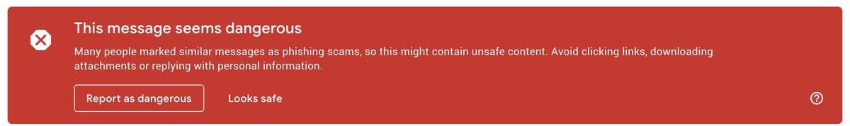 |
|---|
| A screenshot of the banner warning used by Google circa 2017 |
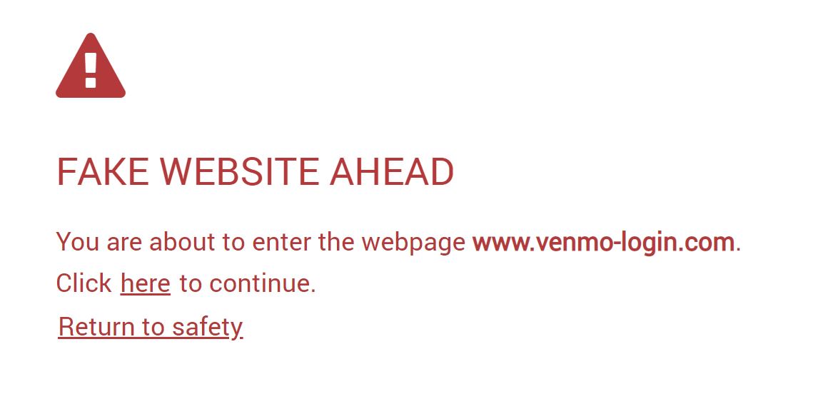
The second type of phishing warning was the full screen browser warning, which appears after an email reader clicks on a suspicious link but before the browser loads a suspicious webpage.
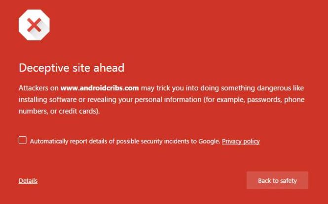 |
|---|
| A screenshot of the full-screen browser warning used by Google circa 2017 |
However, research from warning science suggests that a warning should appear, as much as possible, just before a hazard*. We can imagine how a “Caution: Slippery” sign is not helpful if someone sees it while they are on or after they have crossed a slippery floor.
* Michael S Wogalter, Vincent C Conzola, and Tonya L Smith-Jackson. 2002. Research-based guidelines for warning design and evaluation. Applied Ergonomics 33, 3 (2002), 219–230
If we consider suspicious hyperlinks as the core hazard, then these warnings either appear too soon or too late. Banner warnings appear before an email reader has even looked at an email’s contents or hyperlinks. Browser warnings appear after an email reader has clicked on a suspicious link. Perhaps a warning that appeared right before an email reader clicked on a suspicious link would be most effective. I called this type of a warning a link-focused warning. This synthesis of contemporary phishing warnings and warnings research helped me focus on the first warning feature to test: placement, or where a warning was located within a web browser.
placement then had three different factors or types:
- banner warnings
- browser warnings
- link-focused warnings
As I ideated through what a link-focused warning should look like, I realized there was an opportunity to further leverage insights from security warning research. Similar to banner or browser warnings, link-focused warnings statically mark-up a suspicious hyperlink. Alternatively, the warning could appear dynamically when an email reader hovers over a suspicious link. Prior work suggested that security warnings are most effective when they are actively displayed, rather than statically displayed**.
** Serge Egelman, Lorrie Faith Cranor, and Jason Hong. 2008. You’ve been warned: an empirical study of the effectiveness of web browser phishing warnings. In Proceedings of the SIGCHI Conference on Human Factors in Computing Systems. ACM, 1065–1074
This led to our second warning feature to test, activation. This applied only to link-focused warnings, since browser and banner warnings are only displayed statically.
For link-focused warnings, activation had two different factors or types:
- static (appears with the email content)
- active (appears when an email reader hovers over a suspicious link)
This gave us four different types of warning to test:
- a banner warning
- a browser warning
- an active link-focused warning (appears on hover)
- a static link-focused warning (appears without interaction)
Study 1: Inbox Development
Prior to this work, there were two methods for examining anti-phishing warning effectiveness. One is to show participants email messages on a screen, some of which contain phishing links, and see if they can spot phishing links*. This method is helpful because it provides researchers with the opportunity to speak to participants about phish without any risk of participants visiting phishing websites. It also is possible to create alternate anti-phishing warnings which enables comparisons between different warning features. However, this method does not have high ecological validity; the way that people respond to phish in their inbox is likely different from how they examine emails in a controlled environment with a security researcher.
* Volkamer, Melanie, Karen Renaud, and Benjamin Reinheimer. “Torpedo: tooltip-powered phishing email detection.” ICT Systems Security and Privacy Protection: 31st IFIP TC 11 International Conference, SEC 2016, Ghent, Belgium, May 30-June 1, 2016, Proceedings 31. Springer International Publishing, 2016.
The second way to examine anti-phishing warning effectiveness is to collect and analyze browser telemetry data**. This data has high ecological validity since it represents how people actually interact with existing anti-phishing warnings in their inboxes. However this method is only accessible to corporate researchers. It also is not possible to compare different types of anti-phishing warning without corporate cooperation.
** Akhawe, Devdatta, and Adrienne Porter Felt. “Alice in Warningland: a large-scale field study of browser security warning effectiveness.” 22nd USENIX Security Symposium (USENIX Security 13). 2013.
I sought a middle ground between these two methods, or a way to balance the increased ecological validity of telemetry studies while keeping the ability of user studies to show different warnings to participants and prevent them from clicking on real phishing links. Specifically, this method would need to:
- run on a participant’s device
- display real(istic) emails in an inbox
- display phishing links in some emails
- prevent participants safe from visiting phishing websites
- display different types of anti-phishing warning
- collect participant interaction data with hyperlinks, phishing links, and anti-phishing warnings (e.g., mouse hovers and link clicks)
After some ideation and trial-and-error, I opted for developing a website that presents itself as an inbox to meet these six criteria.
I developed this inbox using Python 3.6 and Django 1.11.3. The link to our GitHub repo can be found here.
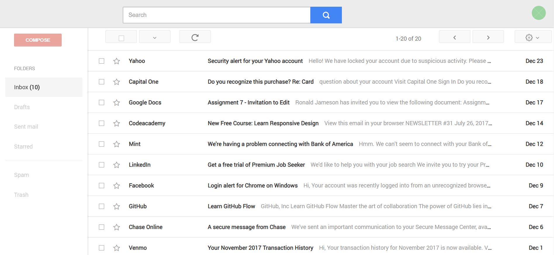 |
|---|
| A screenshot of the email inbox from our first study. |
This website contains and displays emails that I exported from my own email accounts. To make this inbox’s expeprience familiar and intuitive to a broad range of participants, we modeled the inbox’s layout and design on Gmail. However we did remove any indicators or logos that suggested this was actually Gmail to avoid priming participants that Gmail’s security measures were in place.
I further implemented recording features using HTML/CSS and Javascript’s AJAX function. Each time a participant hovered or clicked over a hyperlink in our inbox, I recorded this event and sent the interaction record to our web server. This let us record participant mouse hovers and clicks with hyperlinks, which enabled us to identify differences in the effect of different phishing warning features on participant phishing link interactions.
Study 1: Warning Design
Our next step was to design a set of warnings to show participants. Each warning had to be similar both to each other for internal validity and similar to the existing Google warnings shown above.
After some ideation, we settled on a simple design that had a white color scheme to match the inbox, red accents to signal something was wrong to email readers, and minimal text so the text could remain consistent acrross the five different types of warning. We also included the full URL text inside the warning so participants did not have to look at the status bar in the lower left to check the link’s destination.
 |
|---|
| A screenshot of our banner warning in the inbox. |
 |
|---|
| A screenshot of our full screen browser warning. |
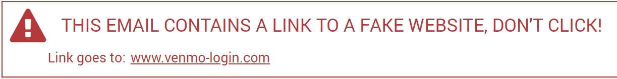
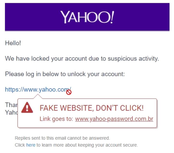 |
|---|
| A screenshot of our static link-focused warning displayed over a Yahoo email. This warning contains an X in the top right so participants can dismiss this static warning if they wish |